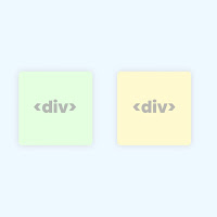
Dear blog reader, today we will be talking about "How to align two div side by side". In HTML, there are styles of elements inline and block detail. Inline factors can place elements subsequent to every difference however they don’t aid peak and width property by using default and block factors aid width and height property through default but we will region block factors like two div side by using facet.
So, here we can see how we are able to make it work. We will see how div can vicinity subsequent to every other in 5 unique approaches.
Top 5 Method to Align Two div Side by Side
- display: inline-block (traditional way)
- CSS flexbox method
- CSS grid method
- display: table method
- float property
- CSS Subgrid (latest, 2023+)
1. Using display: inline-block
This property helps to locate block elements beside each different. But, we need to feature extra width belongings to the block element due to the fact block detail via default takes one hundred percent width.
HTML-CSS
<div class="element">
  </div>
  <div class="element">
  </div>

<style>
.element {
  display: inline-block;
  width: 100px;
  height: 100px;
  background: #ce8888;}
</style>
Preview
Tips: You can change the CSS (style) as per your requirements.
2. Using flexbox
HTML-CSS
<div class="container">
    <div class="item"></div>
    <div class="item"></div>
</div>

<style>
.container {display: flex;}
.item {background: #ce8888; flex-basis: 100px; height: 100px; margin: 5px;}
</style>
Preview
Tips: You can change the CSS (style) as per your requirements.
3. Using CSS grid
HTML-CSS
<div class="container">
      <div class="item"></div>
      <div class="item"></div>
</div>

<style>
 .container {display: grid; grid-template-columns: 100px 100px; grid-template-rows: 100px; grid-column-gap: 5px;}

.item {background: #ce8888;}
</style>
Preview
Tips: You can change the CSS (style) as per your requirements.
4. Using display table
<div class="container">
    <div class="table-row">
     <div class="table-cell"></div>
      <div class="table-cell"></div>
    </div>
</div>

<style>
.container {display: table; width: 20%;}
.table-row { display: table-row; height: 100px;}
.table-cell {border: 1px solid; background: #ce8888; display: table-cell; padding: 2px;}
</style>
Preview
Tips: You can change the CSS (style) as per your requirements.
5. Using float property
<div class="element"></div>
  <div class="element"></div>

<style>
.element {float: left; width: 100px; height: 100px; background: #ce8888; margin: 5px}
</style>
Preview
Tips: You can change the CSS (style) as per your requirements.
6. Using CSS Subgrid (Latest, 2023+)
HTML-CSS
<div class="grid-parent"> <div class="grid-child"> <div class="item"></div> <div class="item"></div> </div> </div> <style> .grid-parent { display: grid; grid-template-columns: 1fr 1fr; gap: 10px; width: 100%; } .grid-child { display: subgrid; grid-column: span 2; grid-template-columns: subgrid; } .item { height: 100px; background: #66D3F7; border: 2px solid #333; } </style> Preview
Tips: Make sure to check browser compatibility for subgrid — currently supported in Firefox and Chromium 117+ (Chrome 117, Edge 117, Opera 103).
Conclusion
- Flexbox and Grid (especially with subgrid) are modern, powerful, and recommended for layouts.
- Inline-block or float may still be useful for simple or legacy use cases.
- Subgrid (2023+) is the best choice for nested components when full grid alignment is needed across multiple layers.

